The other day in class we stumbled across an unplanned but serendipitous means of explaining what web fonts are and how they work. Here’s the tale… ![]()
We were working on building a little emoji search interface (we called it emojitachi, long story!). We haven’t done much work on layout or design, as we were focusing on basic functionality: there’s a search box (an <input>)` and a search button, you type a keyword into the box, press enter, and you see the emojis whose labels match your query. Very simple.
The emoji labels themselves come from this repo, which is in turn derived from Unicode data. The data for a few sample emojis looks like this (actually I simplified it a bit from the original repo, the version we used is here):
[
  // …many more
  {
    "emoji": "🦅",
    "names": [
      "bird",
      "eagle"
    ]
  },
  {
    "emoji": "🦆",
    "names": [
      "bird",
      "duck"
    ]
  },
  {
    "emoji": "🦢",
    "names": [
      "bird",
      "cygnet",
      "swan",
      "ugly duckling"
    ]
  }
  // many more…
]
When you run a search, the app just steps through that array and picks out any object whose names array contains a string which has your query as a substring. (So if you search for duck over the three samples above, you’ll match the first two.)
It’s extremely lo-fi, but feel free to try it out in its current state:
https://docling.land/emojitachi/emojitachi.html
Testing in a room full of computers
Now, this is where things got interesting. I had been developing the code on my own laptop, and sharing my screen over Zoom within the class — so everyone was watching “my” operating system. Of course, people were viewing ontheir own laptops (and a couple of phones and tablets).
So then I figured it would be fun for them to be able to try searching for themselves, so I uploaded the page to domain I run called docling.land. Immediately, people noticed that their results looked different on different devices.
To simulate this duck multiverse, try searching for duck in the two versions of the emoji search engine below:
https://docling.land/emojitachi/emojitachi-no-webfont.html
https://docling.land/emojitachi/emojitachi.html
In all likelihood, if you run the same query on those two pages, you will have differing ducks:
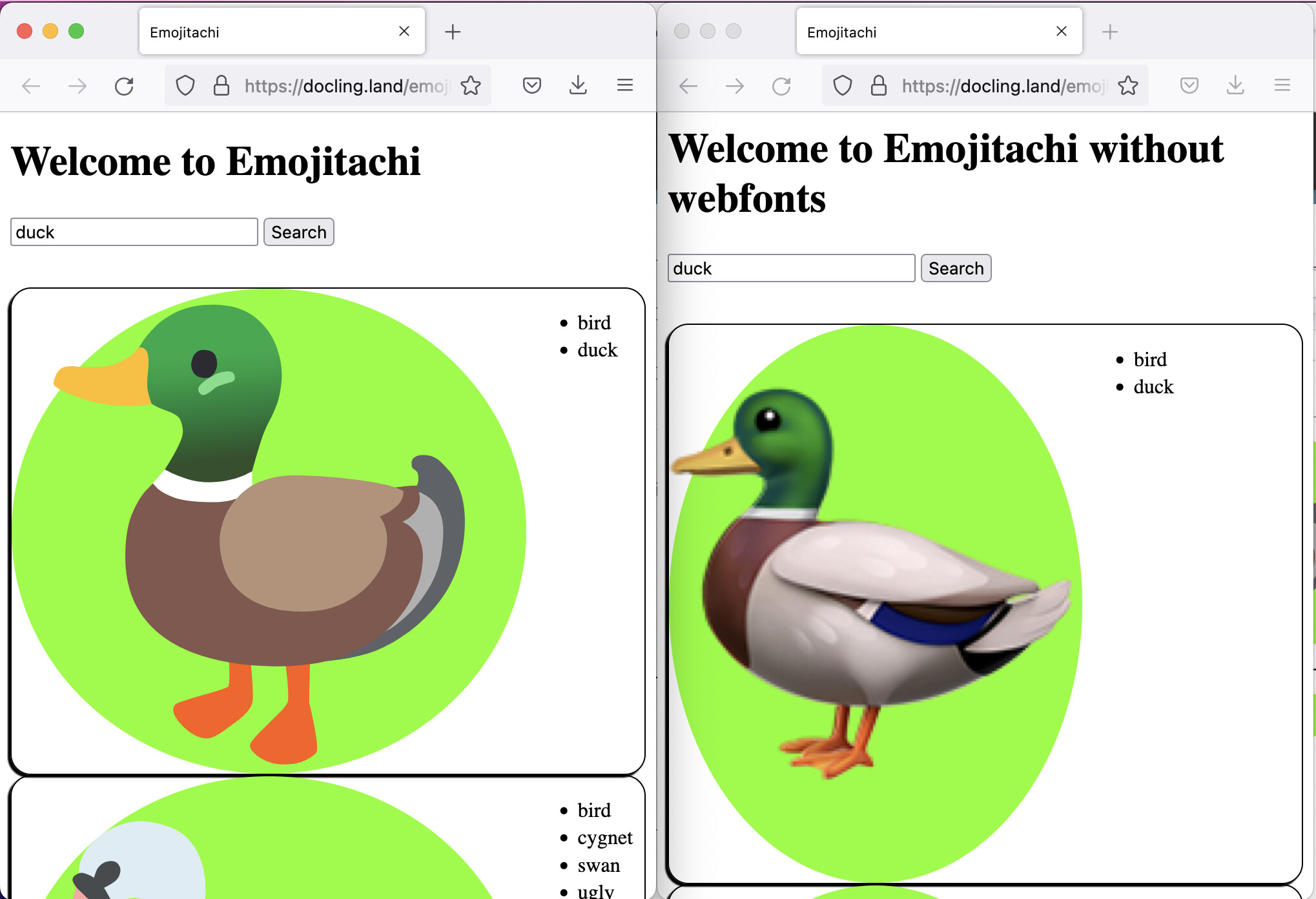
I’m sorry, I have to…
WHAT THE DUCK?So what the heck is a webfont?
Guess what’s going on here?
Fonts.
Emojis are just text, and they are stored in fonts, just like Times New Roman and Comic Sans and all the rest. The difference in appearance of the two ducks had to do with which fonts were are being applied to the emoji content on the page.
By default, when you specify a font in CSS, you use the property font-family:
h1 {
  font-family: NotoEmoji, sans-serif;
}
As you can see, here I’ve added two names for fonts — a specific font called NotoEmoji, and then a generic “keyword” sans-serif, which will pick whatever your operating system’s default sans-serif typeface is.
It’s fairly unlikely that you have installed NotoEmoji on your operating system, so what happens is the browser “falls back” from that specific typeface name (which it can’t find) and then uses whatever sans-serif typeface you have that covers emoji.
Unless we use a webfont in the CSS.
If you look at the CSS for emojitachi.html, which is found here, you’ll see this rule at the top:
@font-face {
  src: url(NotoColorEmoji-Regular.ttf);
  font-family: NotoEmoji;
}
What that says is, roughly, “for any CSS rule in this file where the font NotoEmoji is specified, use this font file right here at this url.”
You can see the file yourself by looking in the directory index:
https://docling.land/emojitachi/
There it is, NotoColorEmoji-Regular.ttf. (ttf stands for “TrueType Font”, which is a font format.)
Okay great, I thought we talked about linguistics around here?
Right, so, this emoji business is just a nice introduction to an idea which is very important for linguistics: we need to be sure that visitors to our web content see that content presented in a font which supports the content. Emoji is just a particularly dramatic demonstration of all this, but with normal textual content, the differences are more insidious, and mostly they have to do with the placement of diacritics.
Fonts don’t just encode the shapes of characters, they also encode rules about how characters combine. It’s the font that supplies instructions that tell the browser (well, really any application) things like
“When an «s» is followed by
U+0323 COMBINING DOT BELOW, place the dot centered below the s.”
It so happens that the font used in this forum is called Nunito, and I can be quite confident that that’s what you’re seeing, since the devtools remind me that Nunito is being delivered as… guess what… a webfont:
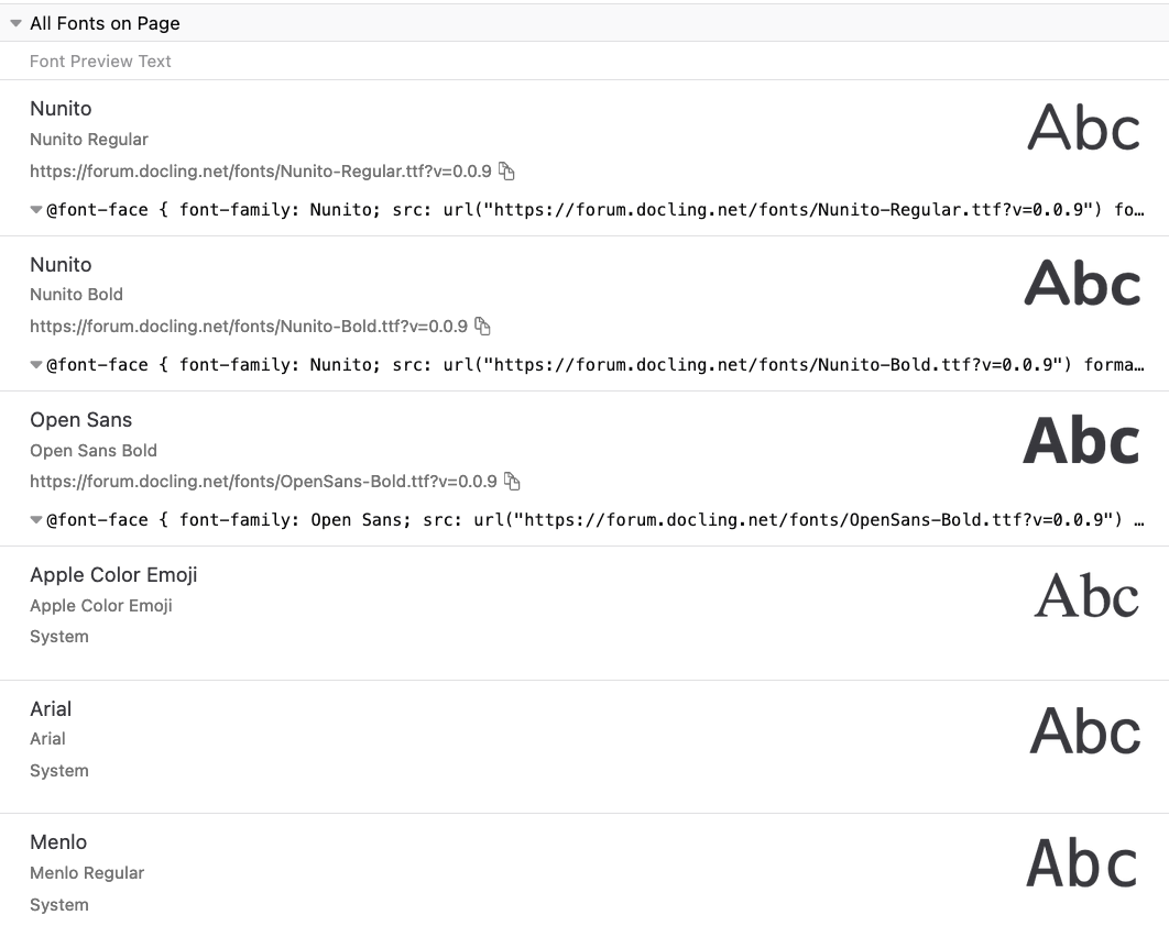
You can see for yourself in Firefox Devtools by going to the Inspector tab and selecting the Fonts sub-tab in the right panel. Notice that the “Apple” fonts do not have an @font-face rule specified. That’s because they were coming from my laptop when I took the screenshot! You will see different “system fonts” if you are on Windows or Linux.
Anyway, I picked Nunito because it has pretty good diacritic support. Consider this lovely s-with-underdot:
ṣ
Protip: Here’s a quick way to access text containing a diacritic whose Unicode Codepoint you know:
Go into your Javascript console, and use a Javascript character escape (like
\u0323) to specify the character you want. Then pass that string as the parameter to the console’scopy()function, which will copy the text to your clipboard.
In fact, most characters will line up the underdot pretty well in this typeface:
ạ ḅ c̣ ḍ ẹ f̣ g̣ ḥ ị j̣ ḳ ḷ ṃ ṇ ọ p̣ q̣ ṛ ṣ ṭ ụ ṿ ẉ x̣ ỵ ẓ !̣ @̣ #̣ $̣ %̣ ^̣ &̣ *̣ (̣ )̣
But notice that the ampersand’s underdot is going on a walkabout. (If you work on a language with retroflex ampersands, Nunito is not the font for you.)
ṣ
Hmm. Well. It’s wandered a bit left in the bold.
ạ ḅ c̣ ḍ ẹ f̣ g̣ ḥ ị j̣ ḳ ḷ ṃ ṇ ọ p̣ q̣ ṛ ṣ ṭ ụ ṿ ẉ x̣ ỵ ẓ !̣ @̣ #̣ $̣ %̣ ^̣ &̣ *̣ (̣ )̣
And a lot of your favorite typefaces lack the necessary rules for combining the kinds of diacritics that are ![]() and
and ![]() in linguistics — both because of IPA and language-specific orthographies.
in linguistics — both because of IPA and language-specific orthographies.
As a matter of fact, there’s an offender right here in this web page. My <h1> tags are set in OpenSans, an otherwise perfectly cromulent typeface. Look what happens if I put our s-with-underdot into an <h1>:
ṣ
Heck, let’s look at a range of characters:
ạ ḅ c̣ ḍ ẹ f̣ g̣ ḥ ị j̣ ḳ ḷ ṃ ṇ ọ p̣ q̣ ṛ ṣ ṭ ụ ṿ ẉ x̣ ỵ ẓ !̣ @̣ #̣ $̣ %̣ ^̣ &̣ *̣ (̣ )̣
Ouch! Wandering underdot syndrome!
So I have some work to do with the CSS on this site. Like I said, font problems with diacritics are insidious, and they can only be debugged with testing.
We as linguists need to get on this train, because we want to make sure that we’re showing the languages we work with the proper respect. And that means working typography.
We wouldn’t want wandering underdots in the O’odham word for ‘stapler’, would we?
![]() si꞉ṣpakuḍ (set in Nunito)
si꞉ṣpakuḍ (set in Nunito)
 si꞉ṣpakuḍ (set in OpenSans)
THE BOTTOM LINE
Always test your typeface for the content and language you’re working with.