Canadian Aboriginal Syllabics (or just “syllabics”) are a family of writing systems used for many of the Indigenous languages of Canada, including languages from the Algonquian, Inuit, and Athabaskan families.
Syllabics have a long and interesting history,
The Typotheque type design company is, IMHO, really cool. They have put a lot of work into supporting a range of writing systems and languages, and they have also made significant contributions to font technology.
https://www.typotheque.com/blog/north_american_syllabics_fonts
They describe their work to design and implement fonts for Syllabics, in collaboration with First Nations users of Syllabics:
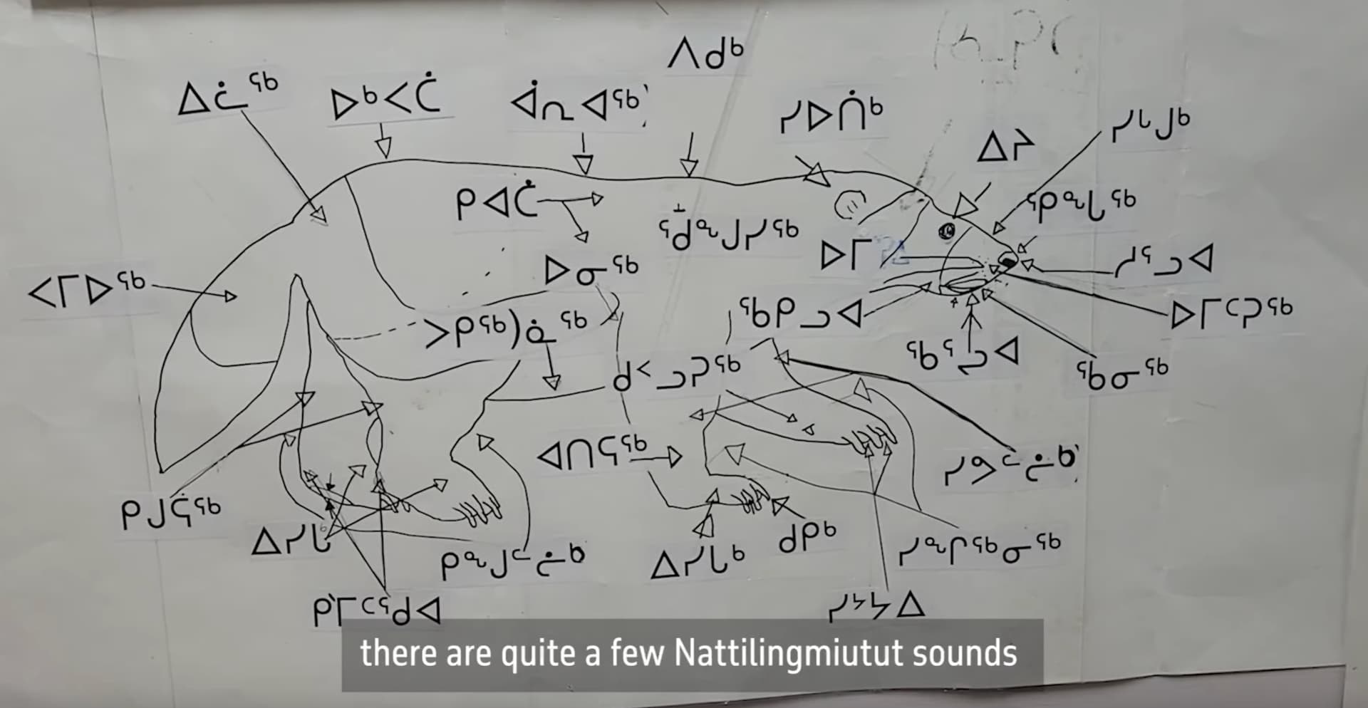
Typotheque commissioned Canadian designer Kevin King to research the Unified Canadian Syllabics in preparation for designing future Syllabics fonts. Kevin identified that the Nattilik community in Nunavut, the northernmost territory of Canada, was missing 12 syllabic characters from the Unicode Standard, which means that the Nattilingmiutut text could not be written down. Kevin worked with Nilaulaaq, Janet Tamalik, Attima and Elisabeth Hadlari, and elders of the Nattilik community to prepare a Unicode proposal to encode the missing characters. Only after the acceptance of the proposal by the Unicode Technical Committee could fully functional fonts for the Canadian Syllabics be designed, a process that took two years.
There’s even a mini-documentary about the languages and writing systems here:

This is a really beautiful documentary, about 15 minutes, filled with interesting commentary from language workers as well as beautiful typography and landscapes. Highly recommended, a little escape from… waves arms around all this stuff.
Check out this little guy:
Creating a Unicode proposal, as @laureng and @clriley (and perhaps others here!) can attest, is no small undertaking. It takes a lot of perseverance and paperwork to get changes into the Unicode (for a documentary history of some Emoji proposals, see The Emoji Story). But being in Unicode can make all the difference for a writing system — check out the history of Adlam for an example of how a whole textual culture has been given a boost by better digital availability of the writing system.
It’s worth noting that while the typefaces themselves are not free (although their prices are not exhorbitant), the work that went into expanding the Unicode Standard to enable these typefaces is now openly accessible. That means that if someone wanted to make a new typeface for Syllabics, or to extend an existing open font to support more languages, they could. Which is good.
More stuff to check out:
- You can see an amazing map of languages which use Syllabics in the first link above, here it is full-size
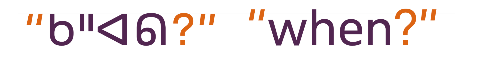
- Syllabics typographic guidelines and local typographic preferences Lots of beautiful diagrams and information here.
For example, check out the subtle difference in readability adjusting quotation marks makes:
(Would love to know if our local Unicode and typography heroes, @clriley, @skalyan, @laureng have any thoughts on this topic! ![]() )
)
 .
.