We haven’t talked about CSS much around here, but it has come up so much in my work at Yale that I thought I would write up a really short intro to something that is incredibly useful: CSS grid. Here goes.
What is CSS?
CSS (for “cascading style sheets”) is a standard that lets you change the default display of elements in an HTML document. You can do a million things with CSS — change typography, color, spacing, even animate stuff.
But the thing I want to tell you about here is layout.
Here’s the thing we will build:
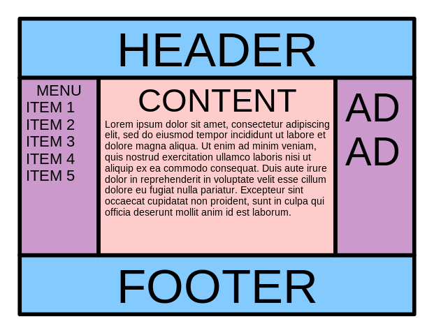
Hilariously enough, in the olden tymes (like, in 2010) this layout was so freaking hard to make with CSS that it because known as “the holy grail”. I kid thee not, there is a Wikipedia article about it. I mean, do a million websites not have this layout? Yes, yes they do. Is it somewhat bonkers that it was so hard for so long to make this layout? Yes, yes it was.
I mean, like, even in language documentation a site with this general shape or something similar is going to be useful sooner or later. (Poke around the sites listed in the #web-documentation category and see for yourself.)
Klingon
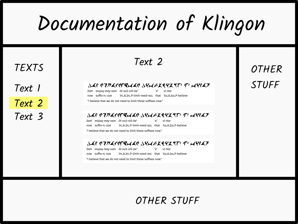
For instance, let’s design a little faux-text browser for Klingon documentation:

Let’s see how to do this using CSS grid.
Let’s make a Holy Grail Layout with CSS Grid
Our Klingon site’s HTML might look like this:
<!DOCTYPE html>
<html lang="en">

<head>
  <meta charset="UTF-8">
  <meta name="viewport" content="width=device-width, initial-scale=1.0">
  <title>Klingon Documentation</title>
  <style>
@import url(klingon-text.css); /* don’t worry about this, it’s for formatting the interlinears */
  </style>
</head>


<body>

  <header>
    <h1>Documentation of Klingon</h1>
  </header>

  <nav>
    <ul>
      <li><a href="#text-1">Text 1</a></li>
      <li><a href="#text-2"><mark>Text 2</mark></a></li>
      <li><a href="#text-3">Text 3</a></li>
    </ul>
  </nav>

  <main>
    <h2>Text 2</h2>

    <section id="text">
      <!-- klingon interlinear goes here-->
    </section>

  </main>

  <aside>
    <h3>Other stuff</h3>
  </aside>

  <footer>
    <p>Other stuff</p>
  </footer>


  <script src="clone-interlinear.js"></script> /* again, ignore this */
</body>

</html>
The
<script>tag and the@importin the<style>are just putting that silly sample Klingon “text” in (with the same repeated sentence). We’re just interested in the high-level content here.
Without CSS
So, if we look at that page without doing any layout CSS, it just looks like this (check it out here):
Not a bad layout, but not a holy grail. We need to “lay out” the tags in this page into a holy grail. Okay, deep breath, here comes some Holy Grail CSS:
body {
   display: grid;
   gap: 1em;
   grid-template:
     "banner     banner      banner    " auto
     "sidebar-1  content     sidebar-2 " 1fr
     "fine-print fine-print  fine-print" auto
 /    1fr       5fr     1fr;
}

body header {  grid-area: banner; }
body nav {  grid-area: sidebar-1; }
body main {  grid-area: content; }
body aside {grid-area: sidebar-2; }
body footer {  grid-area: fine-print; }
And that gives us this (you’ll probably want to follow that link because the embed is going to get a little tweaked when it’s squeezed into this forum page):
Okay, line by line.
The first line display: grid; means “we’re going to set up a grid on the <body> tag.”
The second line gap: 1em means “put a gutter between the panels in the grid.”
We’ll come back to grid-template in a sec, but look at the five lines at the bottom. In that part, we’re saying, “go find the selected tags, and ‘move them’ in to the grid declared on their parent.” So for instance, the line
body header { grid-area: banner; }
Means “go look inside the <body> tag, and find its <header> child. Then, put it inside the <body>’s grid cell which has been named banner.”
The other lines are doing the same thing: “place such and such a tag in such and such a ‘named area’ in the <body>’s grid”.
So it’s that complicated grid-template property that’s actually actually defining the <body> tag’s grid. The syntax takes some getting used to, so what I’m going to do here is just show you why you should care first, then we can talk a bit more about how it works.
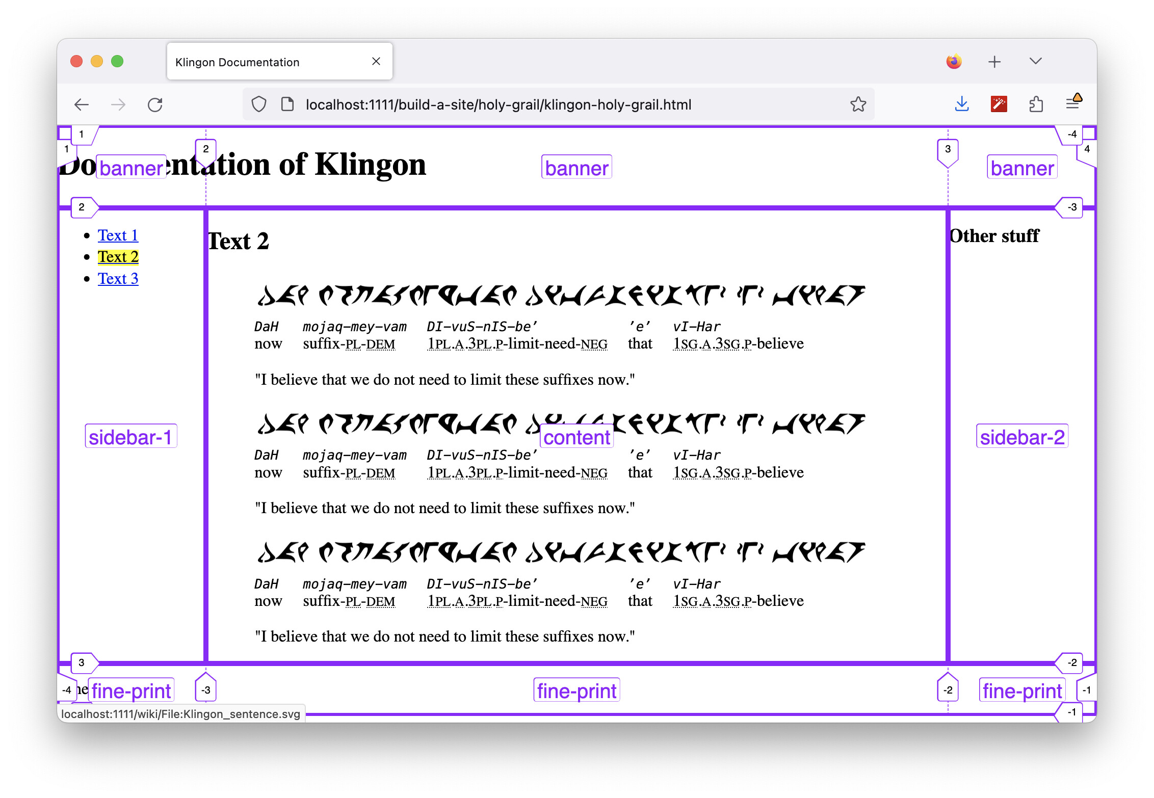
Firefox has a nifty tool that helps a lot when you’re working on CSS grid layouts (more info here), and it will actually overlay area names onto the rendered page. Hopefully this will help you see how that complicated grid-template rule maps onto the actual document:
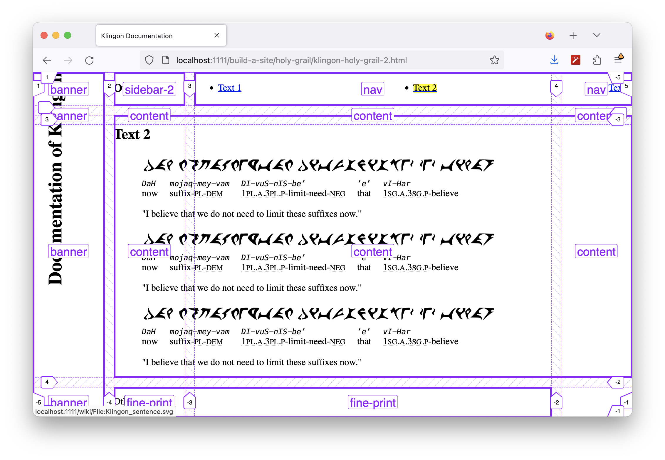
So here is a very different presentation of the document:
A few of the changes have nothing to do with CSS grid per se (I put a flex on the nav links and turned the <h1> vertical, for funsies). The key point here is that the HTML has not changed at all. This turns out to be a very powerful thing, because you can create a simple HTML document and change its display only in CSS.
The great thing grid-template is that it’s easy to drastically change the layout of document without changing the HTML at all. Here’s the Firefox tool again (I renamed one of the areas from sidebar-1 to nav, btw):
I’m going to wrap this up here, but there’s a lot more to say about layout with CSS grid. (I didn’t explain how the widths and heights of the columns and rows are set, for example.)
But I hope that the key benefit of grid-areas is apparent.
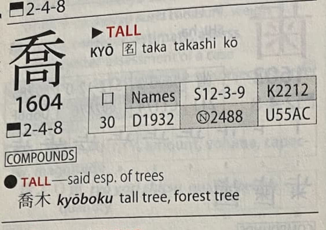
And grid isn’t limited to page-level layout — it could easily be adapted to render a complicated dictionary entry, for instance, something like this:
The fact that that’s even possible with CSS is amazing.
See also:
 (interesting topic :D)