In the Gallery of Parallel Text Formats topic, we looked at several print formats for interlinear texts. In this topic, we’ll look at a single text rendered like those formats, but for the web.
There’s nothing like using real data to surface surprises, and there were several that arose as I put this together. I’d be grateful for any observations or suggestions, and I will incorporate those (with credit!) into the revised code.
It’s been said that the web is 90% typography, and that fact never seems more true than when you try to emulate print formatting on the web. Here are a few problems that stand out immediately:
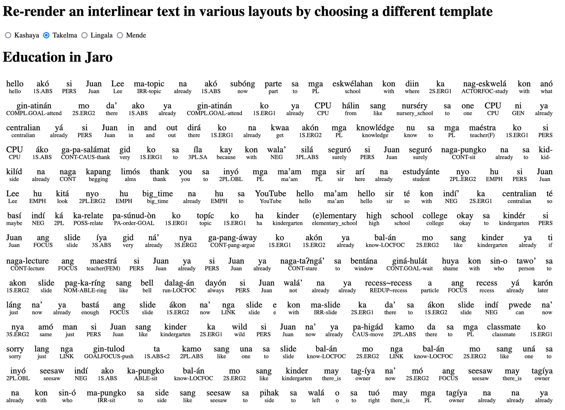
Paragraphs! Paragraphs are important to legibility in many of these formats. In fact, I would say that something like the Kashaya- or Lingala-style renderings are essentially unreadable as-is. This is partly because translations are almost always longer than their source texts, and if the transcription and translations are aligned as large, continuous blocks of text, the alignment drifts. Furthermore, it’s just hard to keep your place in a “wall of text”.
Punctuation! This one surprised me, to be honest. I had never thought about just how crucial sentence-final punctuation can be to reading an interlinear text. As shown in the screenshot above, the Takelma-style format is readable at the word level, but it’s almost unreadable at the text level, because it’s not clear where one “utterance” or “sentence” ends and the next begins. In a standard linguistics-article-style interlinearization, one can dispense with punctuation, since each line is in its own “block”.
In my sample text, punctuation and paragraph information simply isn’t present. And that, of course, is because both punctuation and paragraphs are editorial decisions, and furthermore, they are editorial decisions that are often not made at all during fieldwork.
A few more issues worth considering in a revision:
Line height — we probably need more on the web than in print.
“Measure” — the width of each line in characters
Typeface — Sans-serif or Serif? Etc…
Anyone here have experience setting texts for publication? Care to share any observations?
Hi @pathall I really appreciate the seriousness you are approaching this issue with. I think there is a big difference between presenting an interlinear clause in a paper (the length that the IJAL style targets) and a whole text. For larger texts you might consider taking a look at various bi-lingual Bibles. I have one which is KJV/NIV with Greek and literal English texts as well. See if the library you have can get a copy of this: https://www.amazon.com/Interlinear-KJV-NIV-Parallel-Testament-English/dp/0310950708 The NIV is presented in modern typography on right hand pages whereas the other three are interlinear on the left hand pages. Throughout the Bible printing world many page layout arrangements have been explored.
I find two issues with readability in the presented image/text above:
If grammatical parts of speech indicators are left aligned rather than center aligned then I read things easier. Of course the directionality of the alignment should be reconsidered if both texts are RTL or one text is RTL and the other LTR.
I find that most large interlinear texts follow a rule of one clause-per-line. Multi-line clauses are indented on the second line. Often in many languages it is not clear when one sentence ends and another begins. This often means that the clause is the thing that actually becomes the base unit of analysis, rather than the sentence. The purpose for inter-linear texts must also be considered. Within linguistics the purpose is to illustrate the analysis. In some Bible translations the purpose is so that multi-lingual congregations can follow a reading regardless of the prefered language of the congregant. In the Bible or (multi-lingual law) one language must be considered primary and the other secondary. The secondary language may have more words or alternate phrasing to accommodate alternate logic structures or grammar constructions which are appropriate for a an accurate reading but not congruent in structure. Chiastic structures are present in Greek (at least in Pauline writings) but less approved in English.
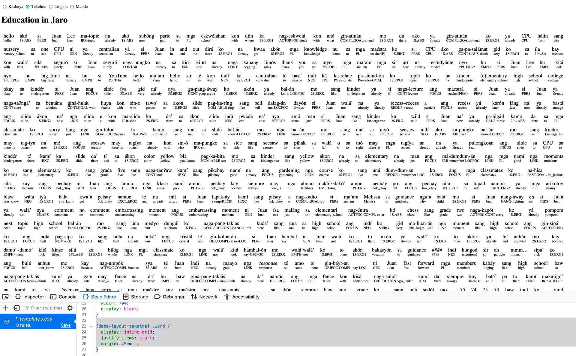
This can be done with CSS. The Kashaya-style layout (the one in the screenshot above) can be set to left-align at the word level. The rule would change like this:
Yes, this is an interesting thing that one often sees. In my own training at UCSB we used the term “intonation unit”, which wasn’t quite a clause (although they often coincide), but the scale is the similiar. In fact, the Hiligaynon text I transcribed is broken up into intonation units, hence the lack of sentence-final punctuation.
Indeed, there is a lot of innovative work that happens in multilingual religious works of all kinds, not just the Bible
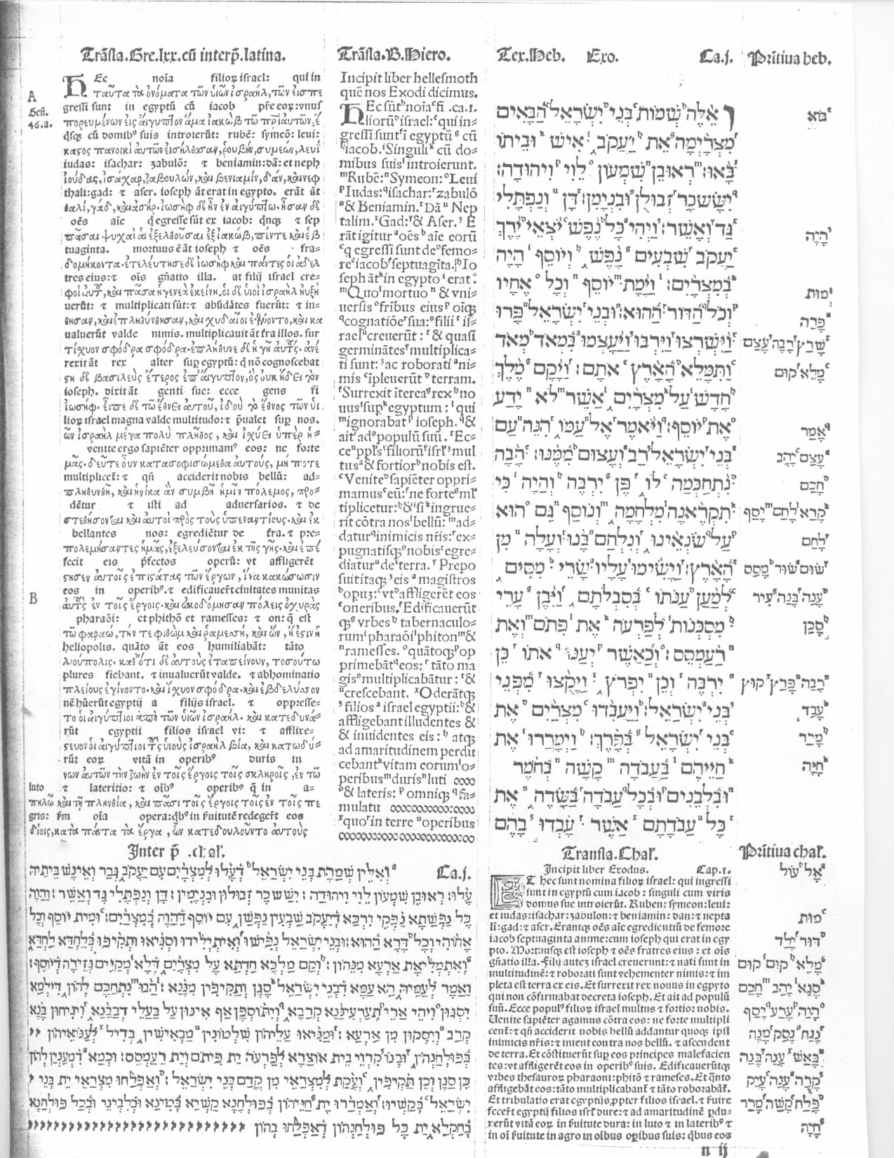
The Complutensian Polyglot (1514), with what looks like several Latin transcriptions, a Latin/Greek interlinear, and Hebrew:
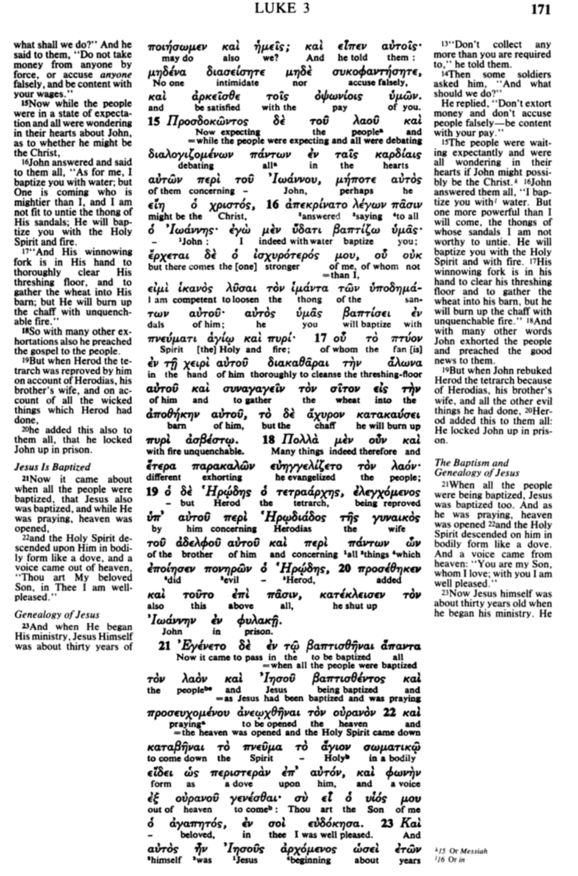
This three-column Greek/English parallel is interesting in that it has not one but two free English translations. They alignment drifts, which explains why the verse numbers are included.
I think the readability of your example would be greatly improved if you just reduced the space between words, and increased the size of the words in the target language. This would more closely approximate the typography of the print models. I don’t think line height is really an issue, especially if there is a clear difference in font size between the text and gloss.
Also (and this may seem trivial), I think there is good reason to put the glossing abbreviations in small caps rather than full-height caps—both for space-saving and for readability. I’m not entirely sure how you’d accomplish this, though; you’d need a tag that applies only to glossing abbreviations, and apply CSS attributes to that tag.
Also, I feel like one of the advantages of the glossing style you’re trying to recreate is precisely the fact that they don’t use morphemic glossing with cryptic abbreviations. Maybe the glosses could be preprocessed in some way to yield more “naturalistic” translations?