@Andrew_Harvey and I are working on a presentation using metadata from various projects we’ve contributed to, and I’ve found this tool called Palladio to be useful for exploring and visualizing the relationships between individuals. Here, for example, is a network graph of researchers and the locations where they recorded:
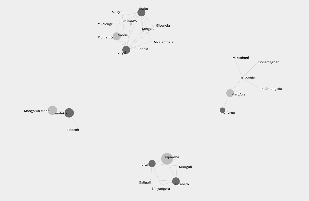
To use Palladio, all you need is some CSV data. The input mechanism is a bit odd because you don’t upload a file but rather paste the data into a text box. After you have done this, though, you can click on the Graph tab and select the two columns from the data that you would like to use for the network graph, and it immediately produces a live and “interactive” network graph. You can export as a .SVG file (without shading as seen in the image above). It also has support for mapping visual connections between locations using the Map tab, and you can limit the data shown in any visualization to a certain period of time.
I found the tool useful for visualizing some (but not all) relationships, and also for detecting data that needed to be cleaned. If an unexpected relationship appears in the graph, for example, then you can look at the raw data to check if it is correct or if it was simply the result of a data entry error.